Tully-Fisher relation vs. morphology and some references therein. I'm accreting ideas for my article.
Thursday, November 29, 2012
Monday, November 26, 2012
Scipy: installing from source
My laptop Linux is old and rotten, so I compile newer versions of Scipy from source. It's being said that compiling blas and lapack libraries is notoriously difficult, but it was not, using this guide (with minor filename changes).
some Python scripts from Durham
A pile of interesting astrophysics scripts, especially the one creating images from GALFIT output files and the other plotting Petrosian quantities for different n.
Sunday, November 25, 2012
awk: making a LaTeX table from a csv file
I found this while digging through my master's notes, potentialy very useful.
awk ' {print $1," & ", $2, " & ", $3, " & ", $4, " & ", $13, " & ", $14} ' galaxies_Cat.txt > table.txt
Converting IDL color table to Python: Matplotlib colour map from rgb array
We have our own colour table, mostly used for kinematics or similar spatial plots. There was some Python code to access it (I think), but it used a look-up table, and didn't look concise enough.
M. from MPIA wrote a short IDL script that basically takes the rgb distribution vectors across the colour table length, interpolates it to 256 bins and creates a callable colour table.
I thought it would be easy to rewrite it. Matplotlib's documentation was quite incomprehensible. It uses a set of tuples to define a colourmap, which is neat and gives you a lot of control, but I had a different input of colour vectors, which was an array of pre-defined rgb values. colors.ListedColormap did the trick, so here is a script to make a custom colour map from a rgb array with matplotlib.


Friday, November 16, 2012
Seeing structure in the data: histogram bin widths
It's easy to lie with histograms. Choosing a small histogram bin width brings out spurious peaks and you can claim to see signal while there are only random sampling fluctuations. Choosing a large histogram bin width lets you smooth over the data distribution, hiding peaks or gaps (see an example using the Cauchy distribution here). Choosing slightly different histogram widths for two distributions you are comparing can lead to wildly different histogram shapes, and thus to a conclusion the two datasets are not similar.
This problem was sitting at the back of my head for quite some time: we are making interesting claims about some property distributions in our sample, but to what extent are our histograms, i.e. data density distribution plots, robust? How can we claim the histograms represent the true structure (trends, peaks, etc) of the data distribution, while the binning is selected more or less arbitrarily? I think the data should determine how it is represented, not our preconceptions of its distribution and variance.
I tried to redo some of our histograms using Knuth's rule and astroML. Knuth's rule is a Bayesian procedure which creates a piecewise-constant model of data density (bluntly, a model of the histogram). Then the algorithm looks for the best balance between the likelihood of this model (which favours the larger number of bins) and the model prior probability, which punishes complexity (thus preferring a lower number of bins).
Conceptually, think of the bias-variance tradeoff: you can fit anything in the world with a polynomial of a sufficiently large degree, but there's big variance in your model, so its predictive power is negligible. Similarly, a flat line gives you zero variance, but is most probably not a correct representation of your data.
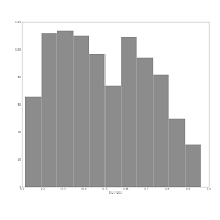
The histogram below, left shows our sample's redshift distribution histogram I found in our article draft. The right one was produced using the Knuth's rule. They might look quite similar, but the left one has many spurious peaks, while the larger bumps on the right one show the _real_ structure of our galaxies distribution in redshift space! The peak near 0.025 corresponds to the Coma galaxy cluster, while the peak at roughly 0.013 shows both the local large-scale structure (Hydra, maybe?) _and_ the abundance of smaller galaxies which do make it into our sample at lower redshifts.

 Also consider this pair of histograms:
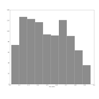
 They show the axis ratio (b/a) of our sample of galaxies. The smaller this ratio is, the more inclined we assume the galaxy to be, with some caveats. The left one was produced using matplotlib's default bin number, which is 10, at least in Matlab after which matplotlib is modelled.
I think are sqrt(n) or some other estimate.
The right one shows the histogram produced using Knuth's rule. It shows the real data distribution structure: the downward trend starting at the left shows that we have more inclined, disk galaxies in our sample (which is true). The bump at the right, at b/a = 0.7, is the population of rounder elliptical galaxies. The superposition of these two populations is shown much more clearly in the second histogram, and we can make some statistical claims about it, instead of just trying to find a pattern and evaluate it visually. Which is good, because we the humans tend to find patterns everywhere and the noise in astronomical datasets is usually large.
This problem was sitting at the back of my head for quite some time: we are making interesting claims about some property distributions in our sample, but to what extent are our histograms, i.e. data density distribution plots, robust? How can we claim the histograms represent the true structure (trends, peaks, etc) of the data distribution, while the binning is selected more or less arbitrarily? I think the data should determine how it is represented, not our preconceptions of its distribution and variance.
I tried to redo some of our histograms using Knuth's rule and astroML. Knuth's rule is a Bayesian procedure which creates a piecewise-constant model of data density (bluntly, a model of the histogram). Then the algorithm looks for the best balance between the likelihood of this model (which favours the larger number of bins) and the model prior probability, which punishes complexity (thus preferring a lower number of bins).
Conceptually, think of the bias-variance tradeoff: you can fit anything in the world with a polynomial of a sufficiently large degree, but there's big variance in your model, so its predictive power is negligible. Similarly, a flat line gives you zero variance, but is most probably not a correct representation of your data.
The histogram below, left shows our sample's redshift distribution histogram I found in our article draft. The right one was produced using the Knuth's rule. They might look quite similar, but the left one has many spurious peaks, while the larger bumps on the right one show the _real_ structure of our galaxies distribution in redshift space! The peak near 0.025 corresponds to the Coma galaxy cluster, while the peak at roughly 0.013 shows both the local large-scale structure (Hydra, maybe?) _and_ the abundance of smaller galaxies which do make it into our sample at lower redshifts.


 They show the axis ratio (b/a) of our sample of galaxies. The smaller this ratio is, the more inclined we assume the galaxy to be, with some caveats. The left one was produced using matplotlib's default bin number, which is 10, at least in Matlab after which matplotlib is modelled.
The right one shows the histogram produced using Knuth's rule. It shows the real data distribution structure: the downward trend starting at the left shows that we have more inclined, disk galaxies in our sample (which is true). The bump at the right, at b/a = 0.7, is the population of rounder elliptical galaxies. The superposition of these two populations is shown much more clearly in the second histogram, and we can make some statistical claims about it, instead of just trying to find a pattern and evaluate it visually. Which is good, because we the humans tend to find patterns everywhere and the noise in astronomical datasets is usually large.
Thursday, November 15, 2012
location of Python module file
http://stackoverflow.com/questions/269795/how-do-i-find-the-location-of-python-module-sources
Friday, November 9, 2012
Tuesday, November 6, 2012
ds9 to NumPy pixel coordinates
I have to crop several images that have defects in them. I will inspect the images using ds9, and crop them with NumPy. Rather, I will not crop the images themselves, but use only part of them for growth curve analysis.
I'll have to update the galaxy center pixel coordinates, as the WCS information is taken from the original SDSS images. They would not have to change if the cropped part is below and right the original center.
I don't have a paper and a pencil at the moment, so I'm thinking out loud here. NumPy indexing goes like this, y first:
ds9, however, uses the standard mathematical notation: (x, y), where x goes left to right, and y goes up from the lower left corner:
This array had its (0, 0) and (10, 20) pixels set to 1:
 tl;dr: if you get a pair of pixel coordinates from ds9 and want to use them in NumPy, you have to swap the coordinate numbers and flip the y-axis, i.e. subtract the ds9 y coordinate from the total image height (image.shape[0]).
I'll have to update the galaxy center pixel coordinates, as the WCS information is taken from the original SDSS images. They would not have to change if the cropped part is below and right the original center.
I don't have a paper and a pencil at the moment, so I'm thinking out loud here. NumPy indexing goes like this, y first:
   +------------------> x
   |
   |
   |
   |
   V
y
ds9, however, uses the standard mathematical notation: (x, y), where x goes left to right, and y goes up from the lower left corner:
y A
  |
  |
  |
  |
  + -------------------------> x
This array had its (0, 0) and (10, 20) pixels set to 1:
[[ 1.  0.  0. ...,  0.  0.  0.]
 [ 0.  0.  0. ...,  0.  0.  0.]
 [ 0.  0.  0. ...,  0.  0.  0.]
 ...,
 [ 0.  0.  0. ...,  0.  0.  0.]
 [ 0.  0.  0. ...,  0.  0.  0.]
 [ 0.  0.  0. ...,  0.  0.  0.]]
And here is the corresponding ds9 view:

Matplotlib: XKCDify, bimodal Gaussians
I tinkered with xkcdify last night, it's a brilliant script. I learned something about bimodal Gaussians too (i.e. functions that are superpositions of two single Gaussians with sufficiently different means and sufficiently small standard deviations).
The source code of the plot is here: https://github.com/astrolitterbox/xkcdify_plots. I modified the XKCDify script itself a little, the rotated labels looked somewhat ugly, when present on several subplots. Might be cool to set the text angle at random.
Someday I'll fork it and add the title and histograms.

Monday, November 5, 2012
Matplotlib: intensity map with hexbin
While looking for unrelated stuff, I found this set of matplotlib examples. This is going to be handy when I'm plotting the output of a spectra fitting tool next week.
Thursday, November 1, 2012
SQLite: one more query
in case my computer freezes again:
SELECT r.califa_id, r.el_mag, 0.396*r.el_hlma, g.el_hlma, f.sum, g.gc_sky - r.gc_sky FROM r_tot as r, gc_flags as f, gc as g where 0.396*r.el_hlma > 40 and r.califa_id = f.califa_id and r.califa_id = g.califa_id
Subscribe to:
Posts (Atom)